Rendez-vous à Roland-Garros: José Maria Sicilia, the colour of sound
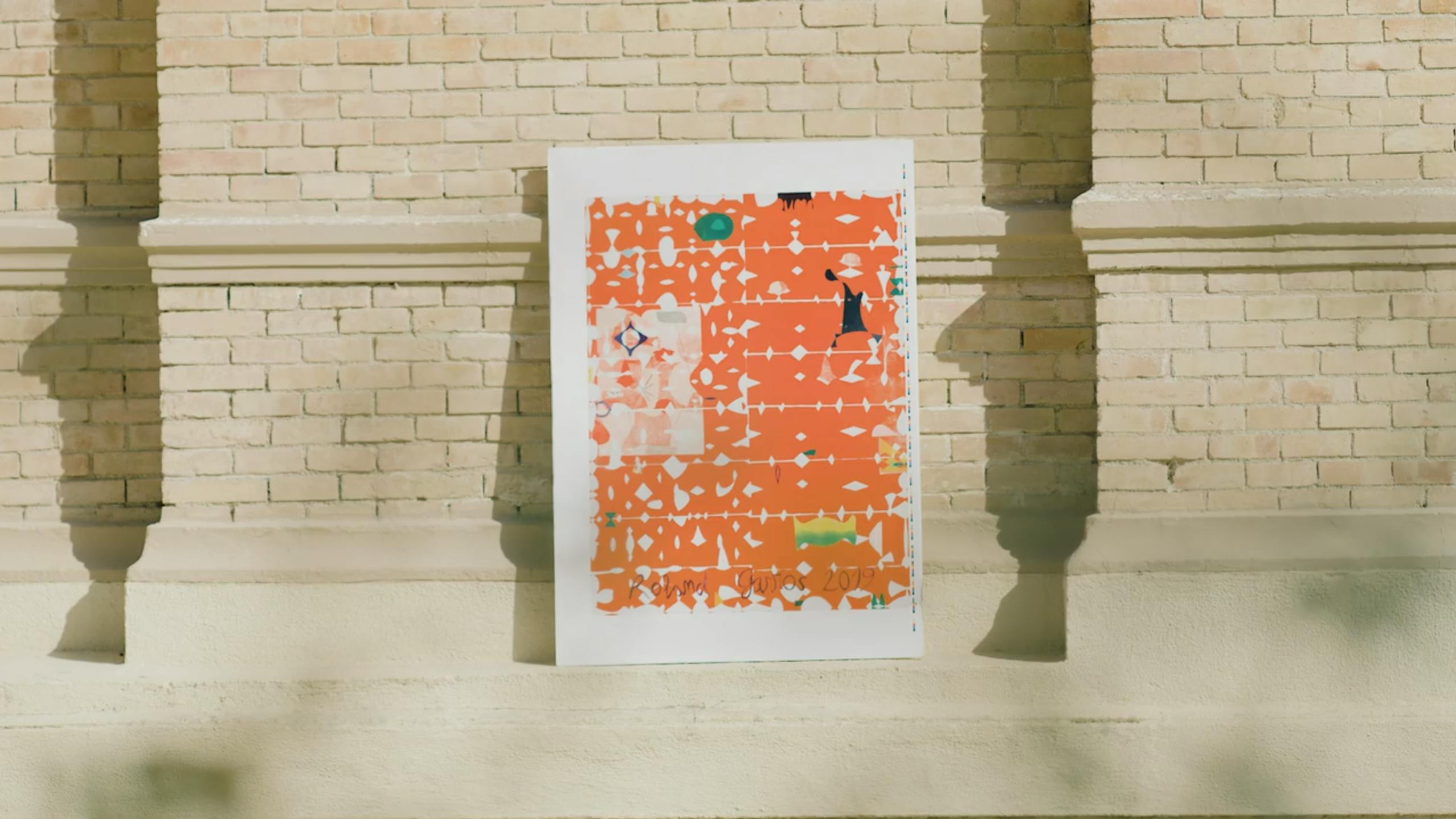
We delve into the Roland Garros archives and pick out three of the most iconic tournament posters.
Since 1980, the French Tennis Federation has brought modern art into the spotlight by asking a different artist to create the official Roland Garros tournament poster every year.
Today, a total of 40 posters retell the history of the Parisian Grand Slam. From scandal to admiration to interrogation, here are three emblematic posters that left their mark and truly stand out in this collection of Roland Garros posters.
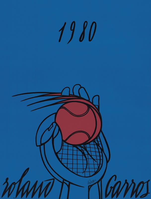
This first-ever poster in the Roland Garros series gave rise to the very idea of the collection. The project was dreamt up by Eduardo Arroyo, Valerio Adami, Jean Lovera and Daniel Lelong (director of the eponymous gallery) and presented, unsurprisingly, to Philippe Chatrier (then-president of the FFT). Forty years and forty posters later, this crazy project has become a signature ritual that kicks off the legendary Parisian Grand Slam every year.
Valerio Adami created the first-ever Roland Garros poster in 1980. Born in Bologna in 1935, he was an important figure in France’s “Figuration Narrative” scene. The Italian artist – who was already familiar with the tennis theme, having used it as the subject of several previous works – was a master in the restrictive exercise of poster creation and the use of space.
His poster features bold colours with black outlines, and depicts a player’s hand performing a serve. It shows the ball, the racquet and the hand coming together to form the beauty of the movement. Jean Lovera explains: “Born from the lovely idea of depicting a stroke, with a simple line, the essence of tennis: a hand, a ball and a racquet. A synthesis with a symbolic value that everyone can relate to, thanks to its universal character.”
The final version, taken from an original drawing, was printed on posters and silkscreen prints in three colours: green, blue and red.

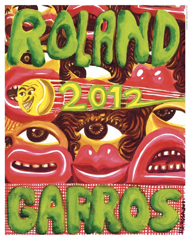
The Roland Garros posters always cause a sensation, and proof of this is the 2012 poster, created by French painter Hervé Di Rosa who, at the time, got everyone talking! A key figure in the “Figuration Libre” movement of French painters, Di Rosa draws inspiration from cartoons, comics, rock music and even street art. His easily-recognised style features strange characters with rounded shapes.
This poster showcases the artist’s crazy and colourful world: a rich and busy composition that includes his famous one-eyed characters. They represent the spectators at Roland Garros as they watch the path of a tennis ball. This is not a conventional representation of tennis. Di Rosa wanted to showcase another essential aspect of the sport: the show, depicted in the eyes and expressions of the spectators in the stands as they watch the ball going from one end of the court to the other.
The ball is the true heart of the piece. “We watch the ball more than the players,” he said. It is the main feature of the poster, projected at high speed and with the year of the tournament following in its wake. The net, meanwhile, is shown as a red grid at the bottom of the poster. Hervé Di Rosa once again plays with all the codes in his art. Though condemned and criticised by some, his poster certainly tells a story.
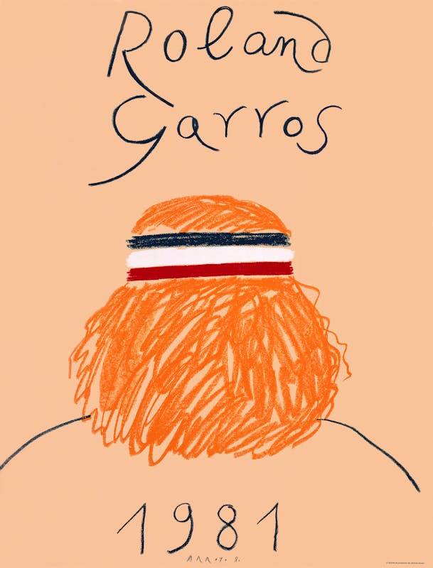
Eduardo Arroyo, who passed away on october 2018, is one of the most important names in Spanish art. Highly active on the political and art scenes, his pieces always had a political dimension and usually focused on topical issues. Arroyo’s pieces are characterised by their flat colours and are often marked by his idea of what the image represents.
He created the poster for Roland Garros 1981, which echoed the “Figuration Narrative” movement of the 1970s. It was the second poster in the Roland Garros series. Arroyo clearly did not want to depict the tournament’s main symbols and usual features (tennis racquet, net, ball or even the red clay), preferring to immerse himself in the fortnight’s hot topics by choosing a very specific model.
From the back, with a bandana around his blonde hair, this character clearly evokes Björn Borg who, since 1976, had been the undisputed king of world tennis. Arroyo was the first artist to depict a player at the peak of their career, still alive and current.
This legendary tennis player, standing alone, represents the image that people had of Roland Garros at the time! The Swedish player had just won four consecutive titles at the Porte d'Auteuil and, a few weeks later, won his sixth and final title on the Roland Garros clay. Could Eduardo Arroyo see into the future?